Brand Identity
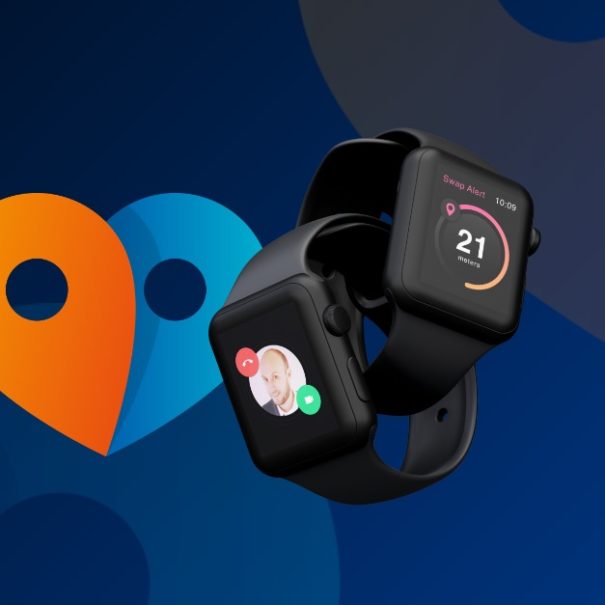
I created the brand identity for Swap, based on the exchange and connections between people.
This symbol has for meaning, the double link between the one who has the SWAP GPS and the other one who follow and take care.
The range of color has been chosen regarding the value that we stream. The orange that brings us the dynamism of people which have the GPS, and the “king blue” for the aspect of surveillance and security.


